Not everyone knows that to improve the house , often , you fall into mistakes that you should absolutely avoid ! An oversight, even if apparently insignificant, can be particularly harmful. You don’t have to be an expert in interior design to get satisfactory results. Just a few precautions to achieve a good level of ecstasy and functionality. Today, we at Realigro, have decided to insert errors to avoid to improve your home. A few simple moves, but really useful.
If you are ready to get to work and modernize your home, we can start!

A first mistake that could be made, is given by the lack of care in the selection of accessories. Even if they are not an integral part of the furniture, accessories play a fundamental role. Furnishing accessories, in fact, are called this way, precisely because they complete the existing environment. It is therefore necessary that this happens in the best way.
Even a carpet, cushions or ceramics on display, must be selected with care. They could be totally distant from the style of your home!
Among the furnishing accessories, we identify the paintings. Whether you are an art lover or not, there is no doubt: a painting solves many problems, especially the room is devoid of character. But did you know that there is a precise rule to follow to best hang the paintings?
In principle, the paintings should be placed 160 centimetres from the floor and placed on a single wall. The criteria are different. By colour, size or style. In short, pay attention to both the heights but also to the combinations.

Are you fond of a particular colour and can’t do without it? The trend is to create monochrome environments. As satisfying as it may be to the eyes of the homeowner, in the long run, a monochrome environment would become tiring. To avoid falling into this error, in an attempt to improve your home, focus on contrasts. Vivid accessories on light walls (or vice versa!).
Always with regard to style, we often underestimate the continuum to be created between table and chairs. Although it is modern the combination of different styles, in this case, it would create only a disorder color. If you do not have the eye of a designer, we recommend that you prefer coordinated chairs and table.
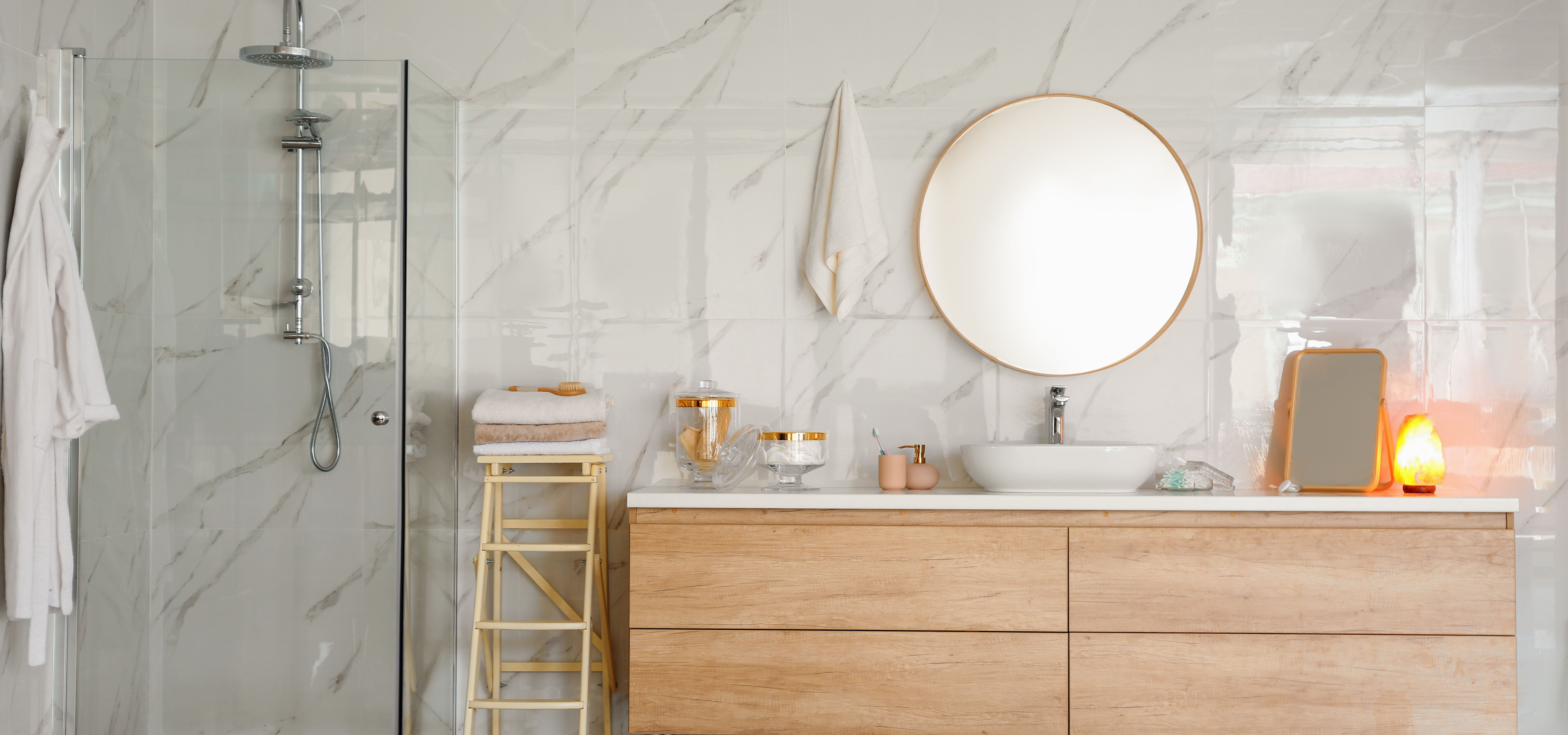
Whether it’s winter or summer, light in the house is crucial. In addition to lighting a room, it gives the furniture and the environment more dynamism. If the room is also small, with the right lighting, it can also seem larger. By lighting we mean not only the right lighting system, but also reflective and naturally bright materials. Mirrors, copper and steel. Give the green light to the imagination, but always following a common thread.
What can I say, after our advice, it will be difficult not to have excellent results!
2005-2019 REALIGRO REAL ESTATE LTD. All Rights Reserved - VAT Nr: 893969932